|
COFFEE TO GO (SZ Poly Cultural Center Store)
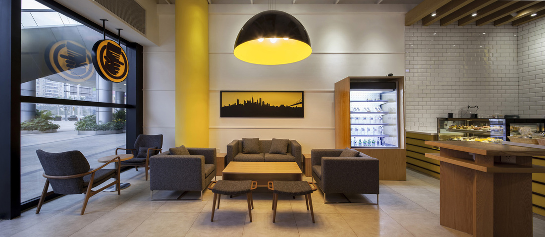
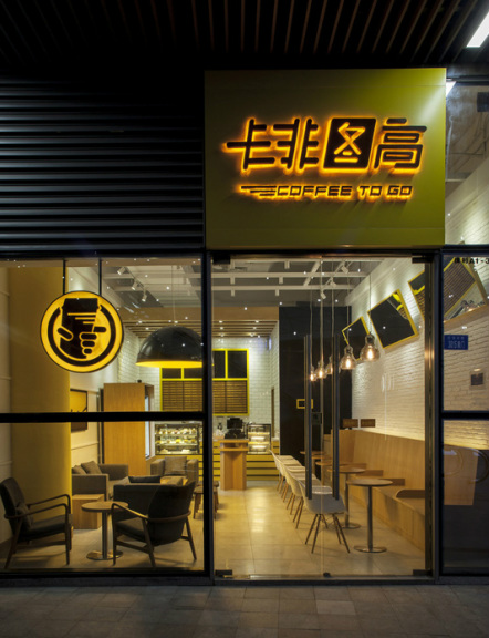
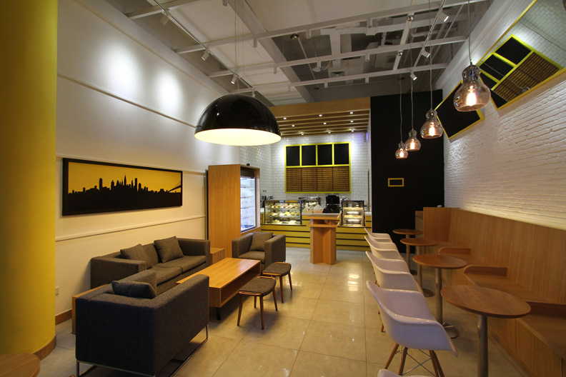
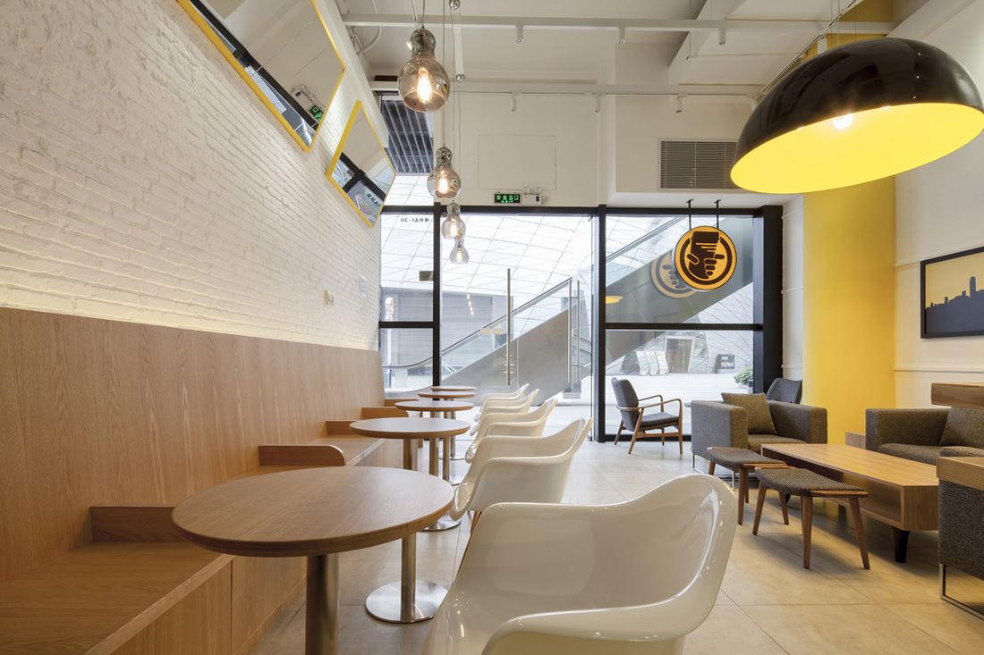
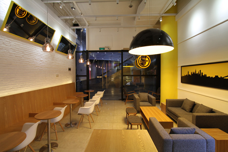
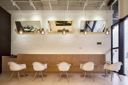
After our successful implementation of the COFFEE TO GO MTR store, the client requested we design a full size cafe which was to have an environment more familiar to a conventional cafe, but with a twist of the CTG brand. We again took inspiration from the logo's directionality and CTG's philosophy of efficiency, quality and consistency; but this time, using Yellow as the core color and theme of the space. The prominence of Yellow pops-out even at a distance to balance the large scale of the site and nearby architecture. Furthermore, Yellow has been shown to stimulate the sensation of hunger (that is why you see Yellow, Red & Orange used often at fast food chains). Color tones are consistent with the MTR store for brand recognition purposes, with yellows and browns selected straight from coffee bean's natural tones, presenting an inviting, head-turning, smile-inducing experience for customers and employees alike. Thoughtful choice of materials, readily available sourcing, prefabricated parts and modular elements ensured the costs and ease of construction was under control. Ultimately, the store was built on-time and on-budget, once again satisfying our client's needs as well as adding an attractive, functional and enjoyable space to the neighborhood. |
Wall Art designed by ARCHMAGE. Inspired by client's passion for New York City
Copyright © 2013 ARCHMAGE and Edward Ng. All Rights Reserved.

